

Admit it or not, most manufacturing websites were built like digital brochures. A homepage with the company founding story. A capabilities page with basic descriptions. A contact form three clicks deep. Truth be told, procurement managers don't spend time on that. They want specs and certifications. They want a way to request a quote without picking up a phone.
A proper manufacturing website design guide starts from what buyers actually need, not what looks good in a template. And that is exactly what we are going to give you here. We will show you what makes manufacturing sites different and give you 9 practices for manufacturing website design that bring in more RFQs.
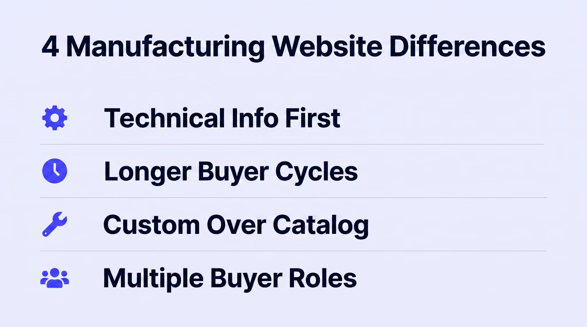
A manufacturing website isn't a SaaS landing page or an eCommerce checkout funnel. The buyers are different. The sales process is different. And the information those buyers need before they will even consider reaching out is different enough that standard B2B templates fall short.
A procurement manager evaluating a fabrication supplier doesn't care about brand values or lifestyle photography. They want tolerances, material grades, and equipment specs.
40% of industrial buyers make purchasing decisions based on their impression of your website. And for a technical buyer, that impression comes down to how fast they can find the spec data they need.
A typical B2B software purchase involves three or four people. Manufacturing procurement pulls in engineers and purchasing agents. Quality managers weigh in. Executives sign off.
57% of B2B buyers have already made it through much of their decision process before they contact a vendor. Your website has to answer enough questions on its own that you survive that evaluation without a sales call.
Most manufacturers don't sell fixed SKUs off a shelf. They produce custom parts based on customer drawings and specifications. The website has to show what is possible, not just what is in stock.
For contract fabricators and machine shops, the product is the process. The industrial web design needs to explain what materials you work with and what tolerances you hold. It also needs to show what certifications back up the work.
The engineer checking your manufacturing capabilities needs different pages than the purchasing agent comparing your pricing. The quality manager wants certifications. The VP signing off wants case studies with dollar figures.
One site has to serve all of them without forcing anyone to go through content meant for a different role. That is why navigation architecture matters more on manufacturing sites than almost any other B2B category.
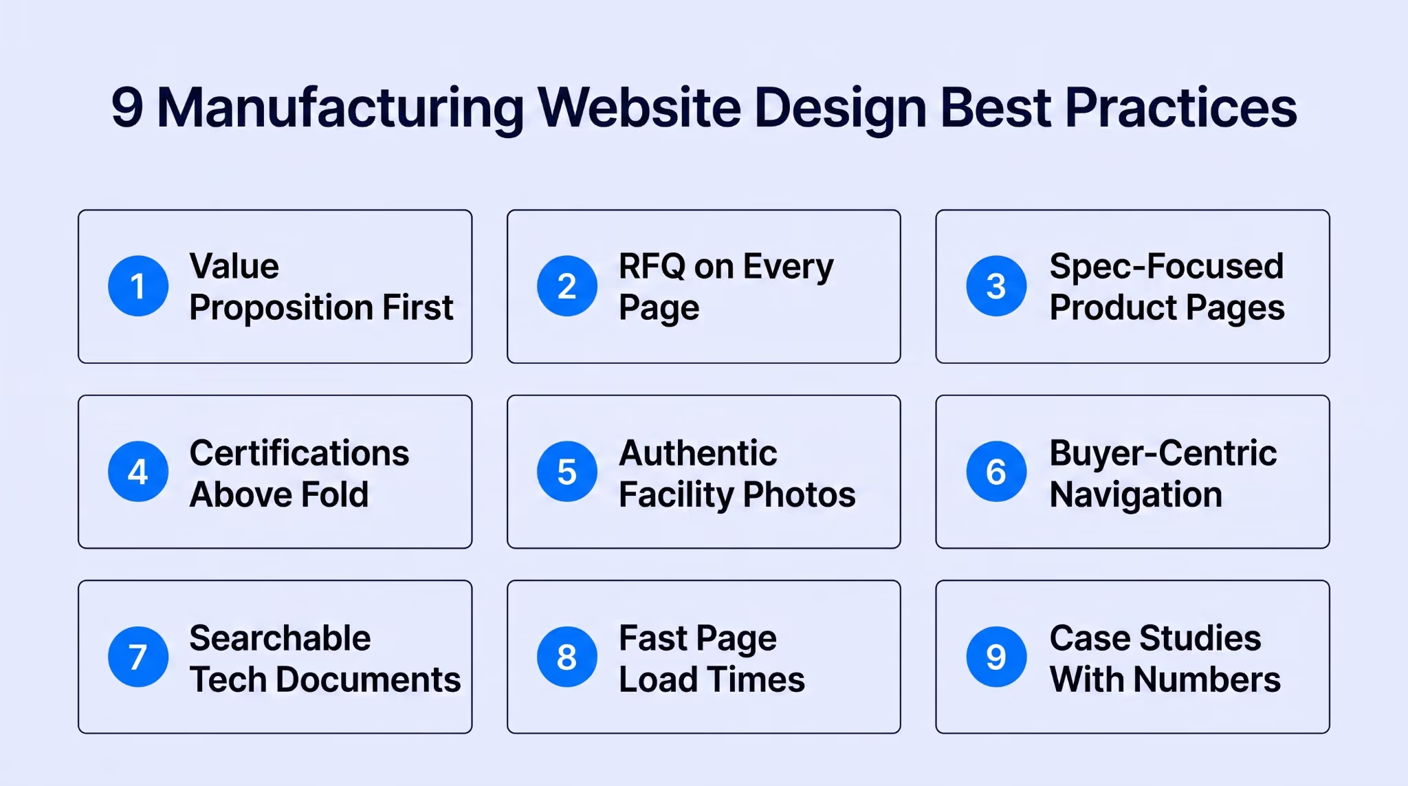
These manufacturing website design practices are ordered around what actually moves a visitor from browsing to submitting a quote request.
When someone visits your homepage, they have about 5 seconds to figure out what you do and whether it is worth reading further. And if the hero section shows gears with "Welcome to Our Company" underneath, those 5 seconds are gone.
The best homepages in the manufacturing industry put the specific capability right up front. "Precision CNC Machining for Aerospace Components" tells a potential customer more in six words than a whole paragraph of general copy would.
Most manufacturing companies stick the contact form on one dedicated page. A buyer reading about your laser cutting capabilities shouldn't have to leave that page to ask about pricing. Every service page needs its own RFQ form.
Engineers and procurement managers compare specifications before narrowing down suppliers. And your competitors are already in a better position if buyers have to go through PDFs or click around to find your specs. Technical data should be the page structureman, not tucked away at the bottom.
One of the biggest UX problems in product-heavy categories is helping buyers choose the right product on their own. Some specifications depend on others. Make those connections easy to see instead of leaving buyers to figure them out.
We have seen companies outside industrial manufacturing handle that kind of spec-matching UX so well that it is worth studying. Take Golf Cart Tire Supply's lift kits page. They built a reference table directly into the category listing that matches tire sizes to recommended lift heights. 20.5-inch tires need a 3-inch lift. 22-inch tires need 4 inches. 25-inch tires need 7 or 8.
Buyers land on the page and check the table. They know which product fits their cart before they even scroll to the listings. The page filters by cart brand (Club Car, EZGO, Yamaha) and by lift height. This lets a buyer narrow 25+ products down to the exact 3 that work in two clicks.
That spec-matching is exactly what manufacturers selling components should use where tolerances or material grades determine which part a buyer needs.
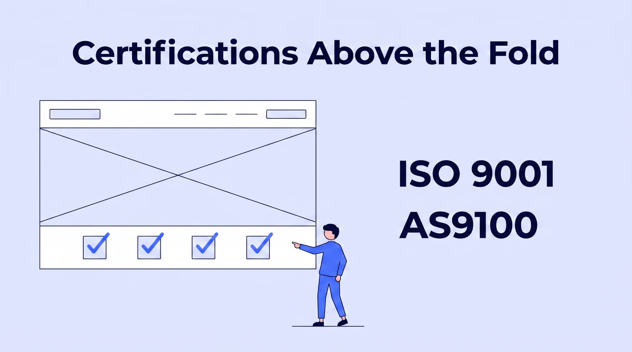
For procurement managers in regulated industries, certifications are a pass/fail filter. If your ISO 9001 or AS9100 badge isn't visible in the first scroll, a buyer on a deadline will assume you don't have it and move on. Certification displays belong right below the hero, not on an About page.
A photo of a spotless generic factory floor tells a procurement manager nothing about your operation. Real facility photos showing your specific machines and your actual team build credibility that stock photography can't match.
Manufacturing buyers check a supplier's website partly to verify the operation exists. Photos of your actual shop floor with your actual equipment give them that verification in seconds.
Too many manufacturing companies organize their menus around the business instead of the buyer. Visitors aren't looking for "Resources" or "Capabilities." They are looking for the specific service they need.
Navigation labels should match how your target audience searches, not how the company's org chart is structured. Using search terms your buyers actually type in your menu labels helps with both UX and organic rankings.
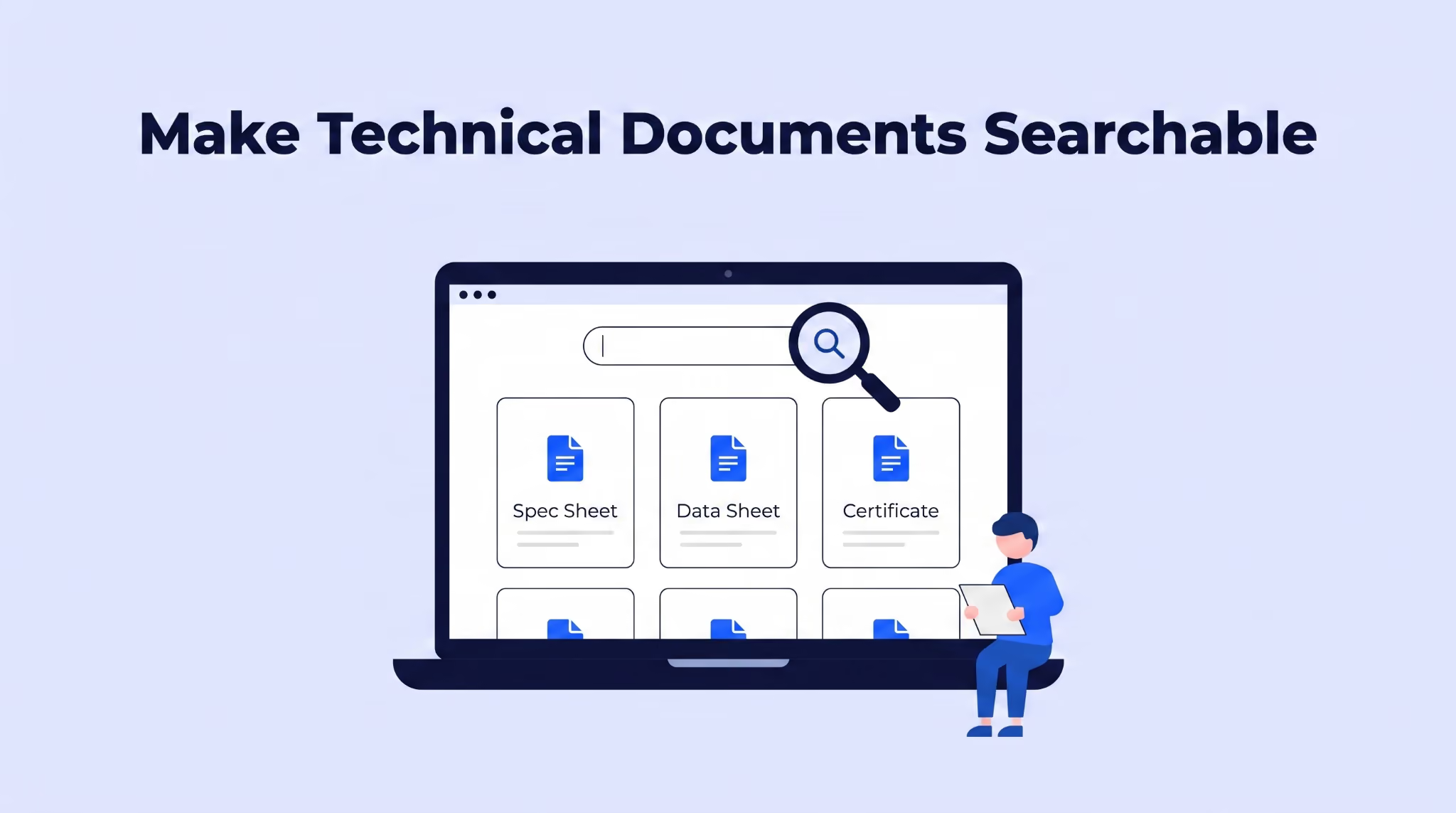
Locking spec sheets behind email-gated forms stops Google from indexing that content. It also stops engineers from finding you through the specific specification searches they run daily. Manufacturers that make their technical resources accessible on the page get more organic traffic from buyers who are looking for exactly those specs.
Making technical content accessible to buyers is one side of the problem. The other is making sure your own team can find and reference the same information internally. The sales team answering RFQs needs that data. So do customer service reps handling technical questions. And so does every new hire learning the product line.
And with 56% of organizations struggling with knowledge retention and transfer, keeping product information organized becomes even more important. If critical product information is in outdated PDFs or only in a few employees' heads, it slows everyone else down.
Most well-run manufacturing teams store this on SharePoint, but those pages end up disorganized because updating them means submitting an IT request. ShortPoint site design platform fixes that by giving non-technical staff a drag-and-drop page builder for SharePoint.
You can set up a searchable internal knowledge base organized by product line or certification type. When a sales engineer needs a specific material data sheet during an RFQ call, they pull it up from a page they can actually read.
And when specs change, the person who manages that documentation updates the page in minutes without submitting a ticket. That kind of internal speed shows up externally too. The team responding to buyer inquiries works from current information instead of last year's PDF.
Manufacturing sites tend to be image-heavy. Facility photos and product shots add real value, but if those images aren't compressed, page speed drops.
According to First Page Sage, industrial websites convert at an average of 2.2%. Every additional second of load time pushes that number lower. A page that takes five seconds on a phone loses buyers who are comparing you against two other suppliers at the same time.
A well-designed manufacturing website requires more than attractive visuals. Strong case studies are some of the most effective content marketing assets manufacturers can publish.
A quote that says "Great supplier, fast turnaround!" tells a buyer nothing useful. A case study that says "Reduced lead time from 8 weeks to 3 weeks on a 10,000-unit aerospace bracket order" tells them exactly what to expect. Manufacturing buyers evaluate suppliers on quantified outcomes and technical expertise.
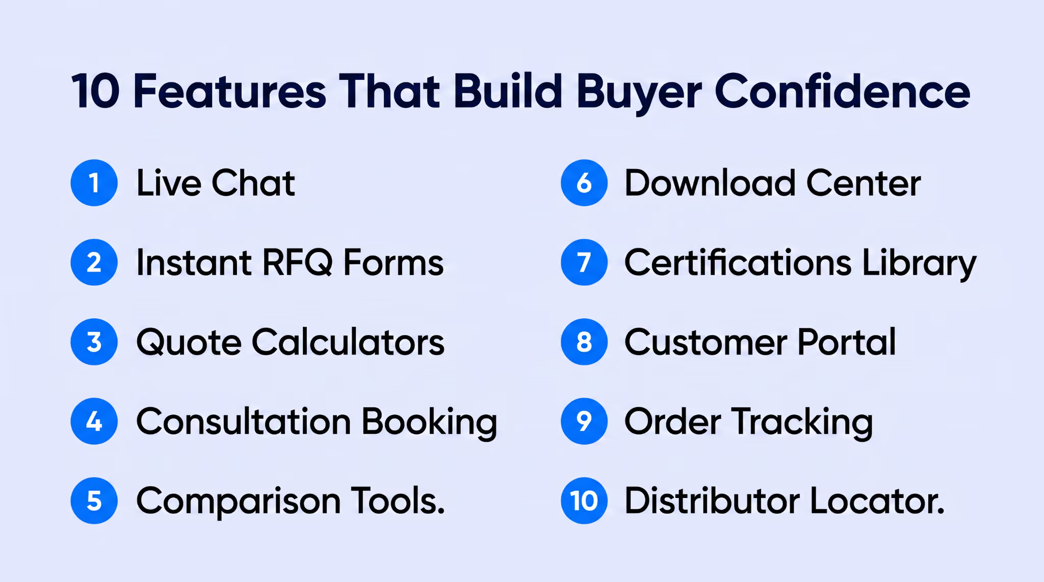
Beyond design elements and layout, these key elements give manufacturing websites the ability to generate qualified leads from buyers who need more than a form to reach out.
Procurement managers evaluating suppliers usually have 1-2 quick questions before they will submit an RFQ. A live chat widget lets them ask without a phone call. You have to make someone available during business hours who can answer technical questions… not just take a message.
A multi-field RFQ form embedded on every service page with a file upload option lets buyers send a request the moment they decide your capabilities match. Pre-filling the service name from the page they are on removes one more step.
An interactive calculator that gives ballpark estimates based on material and quantity removes a barrier to engagement for manufacturers with standardized pricing tiers. That price range lets buyers qualify themselves before your team picks up the phone.
A Calendly-style scheduling tool on the site lets buyers directly book a 15-minute call with a sales engineer. This works better than a "Request a Call" form because buyers can pick a time that works for them and get a calendar invite right away.
When you offer multiple processes or materials for the same application, a side-by-side interactive tool helps buyers evaluate tradeoffs. Compare tensile strength and corrosion resistance across options so the buyer can make an informed recommendation to their internal team.
A centralized page where buyers access spec sheets and material data sheets in one place saves them from hunting through individual product pages. Organize the downloadable resources by product line or material type so engineers find what they need in under 10 seconds.
A dedicated page listing every active certification with the issuing body and expiration date. Include downloadable copies. Quality managers looking for vendor qualifications check this page before anything else on your site.
For manufacturers with repeat customers, a login-based portal where buyers can reorder or review past orders reduces the email exchanges. This is especially useful for contract manufacturers running recurring production runs.
A status tracker that shows where an order is in the production timeline keeps buyers informed without the "where's my order" phone calls. Even a simple three-stage indicator (quoting, in production, shipped) reduces the volume your team handles daily.
For OEMs selling through a channel network, a map-based distributor finder with filtering by location and product category helps buyers find the nearest authorized source. Include contact info and inventory availability, too.
These three industry leaders take very different approaches to manufacturing web design. What they share is a website structure that puts the buyer's needs ahead of the company's org chart.
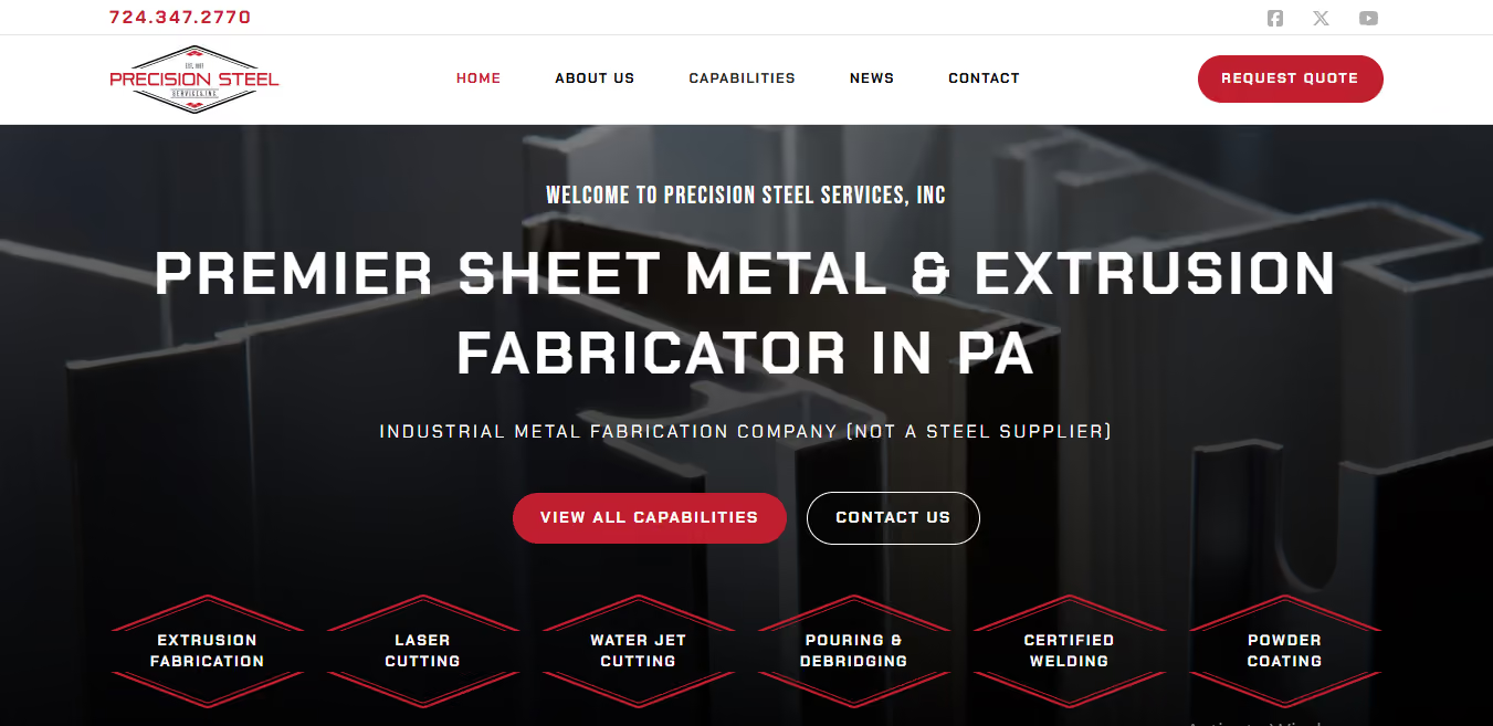
The case of Precision Steel Services is an excellent industrial website design example. It is a sheet metal and extrusion fabricator that kept getting confused with raw steel suppliers in search results. We at weCreate redesigned the site around a single design decision that drives everything else on the page.
The hero section opens with "Premier Sheet Metal & Extrusion Fabricator in PA." Directly below that, a smaller line reads "(Not a Steel Supplier)." That one clarification filters out the wrong visitors before they ever reach the RFQ form.
The capabilities section uses a diamond-icon grid where each process (laser cutting, forming, welding, assembly) links to its own page. The laser cutting page names the actual machines on the floor: twin Boss FC-6012 Elite units. It lists which materials those machines accept. An AWS welding certification badge is within the service description, not on a separate credentials page.
The "Request Quote" button is in the main navigation bar, visible on every page without scrolling. weCreate laid out the entire site using progressive disclosure: a site visitor moves from overview to specs to customer proof to contact. No backtracking required.
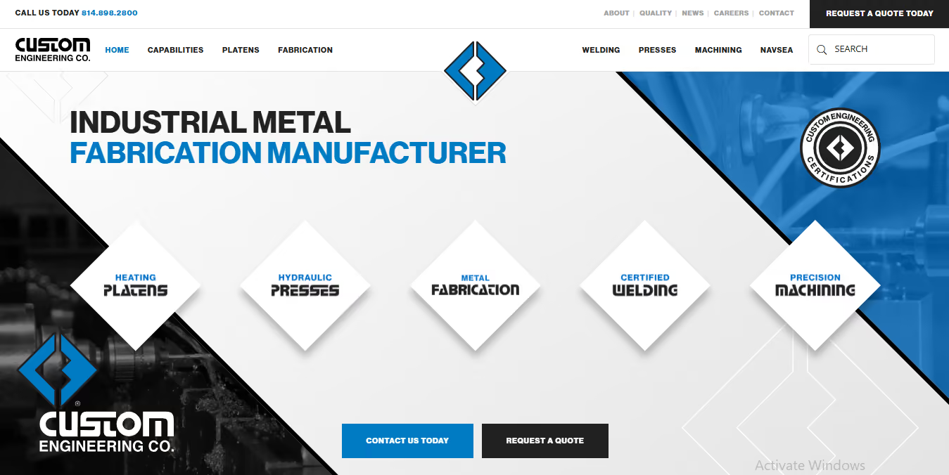
Custom Engineering is a heavy industrial manufacturer working with components up to 160,000 lbs in a 200,000+ square-foot facility. Their previous website was, by their own description, "minimally functional."
weCreate rebuilt it. Now the homepage opens with "Industrial Metal Fabrication Manufacturer" and "Large Scale Contract Manufacturing" as the two hero lines. Five service cards (Heating Platens, Hydraulic Presses, Metal Fabrication, Certified Welding, Precision Machining) each link to dedicated pages with real facility photography. No stock images anywhere.
The credibility section names brands Custom Engineering has manufactured for: Subway, Pizza Hut, and KFC. For a buyer evaluating capacity, recognized brand names answer the question faster than any paragraph of copy would.
Their certifications strip lists ISO 9001:2015 and ASME "U" Stamp alongside NAVSEA and ITAR credentials. A "Request a Quote" button appears on every page. weCreate structured the path from landing to contact in two clicks.
The redesigned site has generated $2.8M in tracked leads over the past year. That includes a $750K defense contract that came in entirely through a web inquiry.
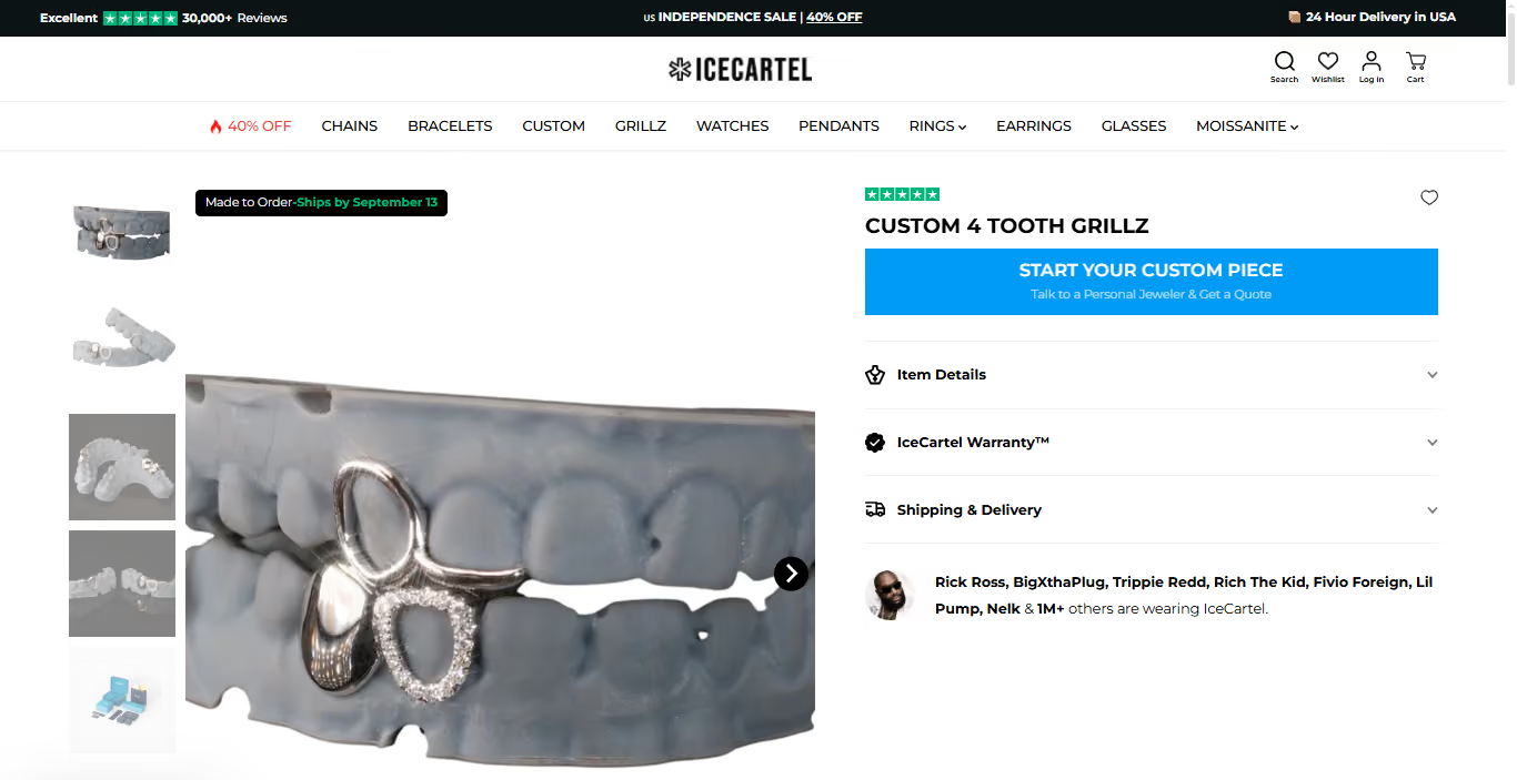
IceCartel is a direct-to-consumer manufacturer that cuts and polishes every piece of moissanite jewelry in-house at its NYC Diamond District location. It is a very interesting and unique case because they solved the hardest design problem in the custom manufacturing business: letting a buyer configure a made-to-order product online without speaking to anyone first.
Their mobile-optimized Jesus piece collection page shows 39 products with inline variant selection built into each product card. Buyers pick gold color and sizing configuration (6 on Top, 8 on Top, 6 on Bottom) without leaving the grid. A Quick View overlay lets them inspect specs without loading a new page.
For fully custom pieces, IceCartel runs a structured process through the site. The buyer discusses their idea with a personal jeweler, then receives a 3D rendering as an exact blueprint along with the quote. Revisions go back and forth until every detail is locked. Then production starts.
Materials range from 925 sterling silver to 14K gold, with higher karats on request. That level of configurability built directly into the browsing experience is exactly what manufacturers need when selling made-to-order components where the buyer's specs drive the final product.
Everything in this manufacturing website design guide points in the same direction: give procurement managers the information they need and make the path to a quote request short enough that they don't leave to check the next supplier. The 9 practices and 10 features here are built around how industrial buyers actually evaluate vendors online. So follow them to a T.
At weCreate, we have spent 15 years building websites and digital marketing strategies for manufacturers, from contract fabricators to OEMs. Every site starts from how the buyer evaluates suppliers, not from a design template. Our builds run on WordPress and Webflow, and they are designed for search rankings and lead generation.
Let's talk and see how we can strengthen your digital presence.